
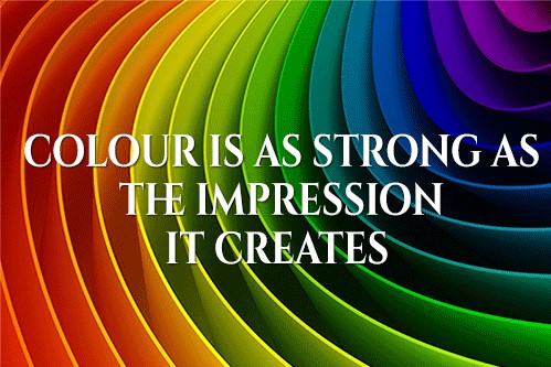
What is the first thing that the human eye notices? What determines our first impressions of a landscape, object or person? What is one of the first things that children learn to identify? Colour! Colour is such an important part of our experience of the world. It affects us more than we know. Colour psychology is the understanding that colours have a profound impact on our perceptions and expressions of our environment. Your brain processes colour quickly and uses it to asses the safety and attractiveness of a situation. That is why the colour scheme of your brand – and your uniform – matters so much. When someone walks in the door to your business or takes a meeting with a member of staff, they notice colour first. This tells them whether your business is trustworthy, exciting, professional, modern and worth investing their time and money in. Colour matters!
Colour Theming
Colour is central to your brand. Colour is what makes your brand recognisable and attractive. So, getting your colour theming right is key. What is colour theming? Colour theming does not mean you need to pick one specific colour or even a range of colours. Good colour theming is flexible. It is about condensing the mood and ethos of your business into a certain aesthetic. Does your business need to represent your friendliness and approachability? Or, your professional demeanour and creativity? Maybe you need to look eco-friendly or family orientated. Whatever your values, colour can play a big role in communicating them.
Red communicates power. Blue speaks of calmness. Black is bold. Grey is neutral and professional. Green is fresh, youthful and vibrant. Colour theming is all about determining a palette and working within that to create a uniform which is unified, flattering and attractive. This palette should be adaptable. There are many different palette techniques you can use. We will run you through a few common palettes, to give you an idea of the options available.
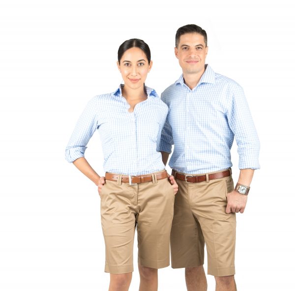 Colour Case Study #1 – Neutral Palette
A neutral palette is a popular choice for many businesses. If you run a business which is office based, or outdoor based, which needs a practical uniform which is unisex and flexible for a range of staff – this could be a great choice. Neutrals are calming and professional while communicating a certain modernity. Or, perhaps you’re looking for light earth tones to suit an outdoor profession or eco-friendly business. For any of these situations – neutral is great! A neutral palette is not just brown. It includes light greys, browns, caramels, cremes, whites, and taupes. These colours blend easily and can be used across a range of uniform pieces. Imagine taupe shirts paired with a creme cardigan and darker brown trousers – voila! A great uniform.
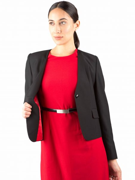 Colour Case Study #2 – Iconic Duo
Another approach to colour theming is choosing two contrasting colours. This has been an iconic choice for brands for many years … just think about QANTAS! Many customer focussed and PR centred businesses choose a bold uniform colour theme which is memorable and distinctive. For example, navy blue combined with red makes a great combination. Other good choices are: orange and black, blue and white, pink and grey, green and yellow and brown and cream.
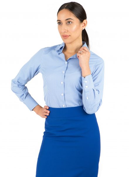 Colour Case Study #3 – Moody Blues
Do you have a business which needs to look traditional, elegant and chic? Do you work in a stressful environment and need a calming influence. A ‘moody blue’ palette might be a perfect choice. This palette usually includes a range of blues, from sapphire to steel. Oceanic tones – perhaps with a touch of silver for added interest. This palette is a wise choice for many different uniforms – from those in the healthcare sector to retail and beyond.
